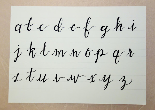
I think it's fair to say the blogosphere is a fan of modern calligraphy and it's all over Pinterest. So I wanted to give it a try because it looks so cool. I started by googling 'modern calligraphy alphabet' and copying the letters.
I did a bit of research and watched a few youtube videos before making my first attempts. The method I chose to use is a two-pen approach. This was due to lack of proper equipment more than anything. First I draw the whole letter with a fine Berol marker, then I go over the down strokes with a broad Berol marker, to emmulate the way a nibbed pen and ink looks.
I roughly drew out guidelines in pencil which helped a lot. I drew three lines; one for the letters to sit on, one for the tall letters to go up to, and one for the 'tails' to hit (I'm sure there are proper terms for these elements). It kinda took me back to handwriting practice in Year 4.
Next I need to look at fancy capital letters and maybe I'll get on to using a proper brush pen or nib pen.


No comments:
Post a Comment